SOURCE: EOS
DATE: March 12, 2018
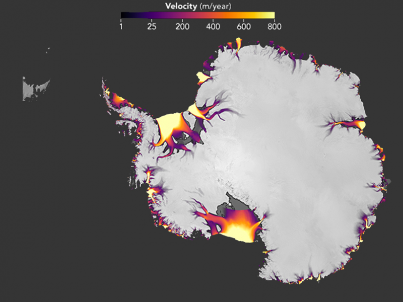
SNIP: From bold purple to brilliant yellow-orange bursts, the map above pinpoints regions along coastal Antarctica that have recently experienced moderate to severe ice loss. The map’s surface ice velocities, measured in meters per year, come from Landsat 7 and 8 data averaged over 2013–2015.
As this map shows, ice loss in western Antarctica is faster and more extensive than in the east, particularly in the Ronne (upper) and Ross (lower) ice shelves. The data underlying this map that depicts recent Antarctic ice flow are from a 13 February study published in The Cryosphere.
Not only is ice loss in western Antarctica already much higher than on eastern shores, but it’s also accelerating, according to the research team behind the map and paper. By comparing the most recently available Landsat data with earlier estimates of ice velocity from 2008, the team could determine where ice loss has sped up or remained steady across nearly the entire Antarctic Ice Sheet.
[T]he speed of ice loss [in the Marguerite Bay area] increased from about 2,600 to 3,000 meters per year in some locations. That’s a jump of roughly 400 meters per year (15%).